My last post (on things to consider when building a website for a smaller, local business) generated some interesting discussion on LinkedIn about whether or not to design a website that requires viewers to scroll, rather than clicking to another page. Based on my experience and the available research, I’d say “go with a website that requires (limited) scrolling” – and here’s why.
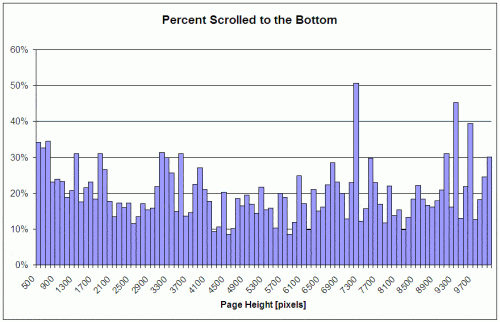
Early usability research suggested that only 10% of website viewers would scroll down to read content below the fold, resulting in many website designers limiting websites to a maximum of 768 pixels in height (the typical browser window was 1024 x 768 pixels). However, as website design and load times have improved, and viewers have gained more experience with websites, the majority of viewers will now scroll to the bottom of a web page.
That’s not to say that your website content should be spread everywhere up and down a long web page. It’s still true that the most important content should be above the fold. In fact, a study by Jakob Neilsen found that most user viewing time was spent looking at content above the fold.
- Above the fold: 80.3%
- Below the fold: 19.7%
But don’t let that statistic scare you. And don’t try to stuff all of your content into a tiny window to avoid making people scroll down. Website design and usability are still critical. Leave plenty of white space, use proper column widths, include appropriate images, and write great copy.
Most People WILL Look Below the Fold…
… they just need to be encouraged to do so. Researchers have found a few things that will do that, including:
- Making the area just above the fold clearly look like there’s more content below, and
- Placing interesting content above the fold that inspires people to keep reading.
Cut Off the Page Bottom
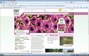
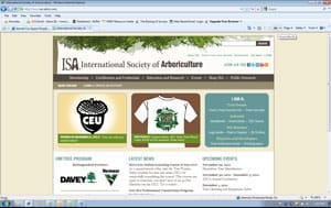
In ‘On the Art of Writing Copy’ (sometimes called the “copywriting bible”), Herschell Gordon Lewis writes that “readers demand completeness.” He suggests ending each page with an unfinished sentence that forces the reader to turn the page (for example, in a direct mail letter or a newspaper article). The same concept applies to web pages – set up your page so that the copy is cut off at the bottom, making it clear that there’s more copy below. And avoid ads or images that run across the entire page near where the fold may be (recognizing, of course, that the location of the fold varies across monitors, browsers, and more). For example, both of the sites shown below have the navigation and main content at the top (to be sure everyone will see it), but it’s clear that there’s more content below, easily accessible with just a simple scroll…
Inspire Viewers to Read More
People have a limited attention span and will quickly lose interest on a long page. They prefer sites that get right to the point and make it easy to do things quickly. Scrolling is extra work. However, a report by the web analytics company Clicktale showed that the length of a page does NOT affect whether or not a viewer will scroll down the page. What’s more important is the content –
- Is it interesting?
- Does it provide what they’re looking for?
- Is it easy to read?
- Does it look good?
Here’s what to do…
Put your most important and interesting information at the top of the page, make it clear that there’s more great content below the fold, and people WILL scroll down.
