To realize the many benefits of an email list, you need to have people on your list. Pretty obvious, right? But how, exactly, do you generate a list in the first place?
To get people on your email list you need to do two things:
- Ask them to sign up (I give you tons of ideas for how to do this here)
- Have a way for them to provide their email address to you
In other words, you need an opt-in or sign-up form.
It sounds simple enough – pull together a form, put it on your website, and ask people to fill it out.
But here’s the problem – if it’s done poorly, very few people will sign up. You might as well not even ask. The key is to create a form with a high conversion rate (meaning that a high percentage of visitors who see the form actually sign up).
How to Collect Opt-In Data on Your Website
There are two basic ways to collect opt-in information online – an opt-in box or form and an opt-in page.
An opt-in box is a small sign-up form that’s placed on your website (you can see mine at the bottom of this page). Subscribers input their email address (and any other requested information), the information is collected in your email list software, and you use it to send them content.
An opt-in page is a website landing page that’s specifically designed only to collect subscriber information. Brian Clark over at Copyblogger has written a nice piece about creating a high-converting opt-in page so I’ll focus here on opt-in forms.
Elements of a High-Converting Opt-In Form
There are four key elements to creating a high-converting opt-in form.
- What it looks like
- What it says
- Where is it
- What it asks a subscriber to do
Unfortunately, most people get hung up on the appearance of their opt-in form and the other three elements become an afterthought. Big mistake!
Design an Attractive Opt-In Form
Treat your opt-in form like any other webpage on your site. The design (layout, color, font) should be consistent with your website design, but should stand out enough to catch a visitor’s attention.
Most of the popular email marketing applications come with opt-in form templates that can be easily inserted into your website, even without any technical knowledge. Simply change the color and wording to be consistent with your brand and website.
A good option (and the one I personally use) is from ConvertKit (aff). It integrates seamlessly with WordPress sites through a plug-in and allows you to put a different opt-in form on each post, page, or sidebar area. It even lets you create landing pages (either on your domain or hosted with ConvertKit – you don’t even need a website to have a landing page!). I love how flexible it is.
Opt-in Form Content
Make it Quick and Easy
The simpler your opt-in form, the more subscribers you’ll get.
Think about what you really need to know about your subscribers. To send them emails, you need their email address. That’s it. Maybe a first name if you want to get fancy and personalize emails – although many people won’t give you their real name so you could be sending emails to “Dear Test1” or “Hi Sample.”
Use a simple, clear button that people will click to subscribe. This isn’t the place to be creative – make it crystal clear that it’s a ‘subscribe’ button.
Consider using phrases on your button like ‘join the community’ or ‘sign me up’ instead of ‘subscribe.’ People tend to shy away from subscriptions but do want to feel part of something bigger, like a community.
Allay Their Fears
A lot of potential subscribers are reluctant to sign up because they’re worried about getting useless emails and spam filling up their inbox. You’re probably had an experience like that yourself.
The key is to build trust before asking for the sign-up.
How?
Let them know up-front exactly what you will and will not do with their personal information.
Place a link to your privacy policy right under the subscribe button – make sure it’s highly visible. Most people will never click on that link or read your privacy policy but just the fact that you have one helps to build trust that you’ll treat them with respect
Write your privacy policy in simple language that’s easily understood – skip the jargon and legalese. Clearly describe how you will use their email address (for example, to send them blog updates and occasional special offers), that it won’t be sold or traded, and that they can decide to opt-out of further communications at any time.
Avoid Pre-Checked Boxes
It always annoys me when filling out an order form or opening an account online to see that there’s a little checkbox, usually with tiny text next to it, that’s already been checked. Unless you un-check that box, you’ll find yourself subscribed to all sorts of email lists, not only from the company whose form you’re filling out, but possibly also a range of 3rd parties you don’t even know.
Don’t do it!
Let people check the opt-in box themselves. They’ll check it if they want to hear from you; they won’t if they’re not interested.
You end up with a more engaged list and you stay within the letter of the law (the CAN-SPAM Act requires “affirmative consent” before you can send commercial emails to people).
Offer an Incentive
Offer subscribers something that they value.
That means understanding your audience so you can provide something that they can use, that addresses their needs, and that they’ll actually want.
It doesn’t have to be elaborate or expensive, but it should be something that’s closely related to your services or products. Successful offers include things like ebooks, checklists, exclusive discounts, first notification of sales or promotions, and prize drawings.
Opt-in Form Placement for High Conversion
What’s the point in creating a beautiful opt-in box with great content if your readers don’t see it? You want viewers to see that opt-in box on every page – often in multiple places on a page.
Derek Halpern at Social Triggers describes seven places to put your opt-in form (worth a read!). You probably don’t want to put an opt-in box in every single location, but here are some to think about:
- Top of sidebar
- End of each article or post
- ‘About’ page
- Footer
- A bar across the top of your page (Hello bar or Viper bar are good options)
- Feature box
- Pop-up box (lots of options here but SumoMe is a good, and free, choice, while OptinMonster is a great paid option)
Where you place an opt-in box depends on the layout and content of your website, your audience, and your goals.
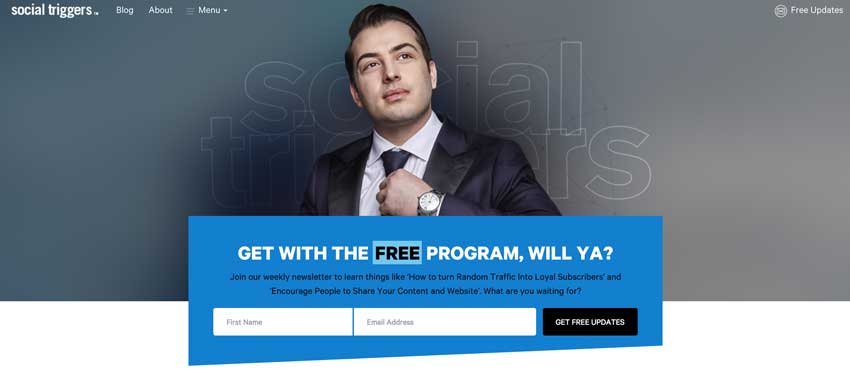
You can’t miss the opt-in form that’s prominently displayed at the top of the home page on socialtriggers.com
For example, if your website is an online store, you’ll probably want to place an opt-in form at the top of the sidebar, on your ‘About Us’ page, and in the footer. You don’t want to detract from the primary purpose of the site, which is to sell products.
If you’re a retail outlet, then a feature box could work well.
And if your website has lots of articles (perhaps some how-to articles or a blog), then you should place an opt-in form at the end of each article or blog post. You’ll see my opt-in form at the end of this article (I’d love it if you signed up!).
Pop-up boxes generally convert well. However, they’re very much “in your face” and a lot of website visitors find them annoying. I use them sparingly (you’ll notice one on this website – please sign up if you liked this article!) and generally have them trigger when someone is about to leave my site. But if the primary purpose of your website is to generate leads or email subscribers, then it’s worth considering.

This pop-up form makes it very clear what you’ll get if you subscribe on michaelhyatt.com
Optimize the Opt-In Process
Consider Double Opt-in
The debate over the benefits of single versus double opt-in rages on. I’m not sure there’s a single best answer to this one.
In a single opt-in process, the subscriber enters their information into your opt-in form and clicks on the ‘subscribe’ button. That’s it. They’re immediately subscribed to your email list and receive a confirmation of that subscription in their inbox.
A double opt-in process requires an additional step. After clicking ‘subscribe,’ the subscriber is taken to another web page where they’re told that they will receive an email containing a link. To complete the subscription process, they must click on the link in that email to confirm that they do, in fact, want to get emails from you.
With a single opt-in, you’ll get more subscribers. However, they’ll tend to be less engaged, you may see lower open rates, and will likely have more unsubscribes (especially if you’ve offered a one-time product or service as your sign-up incentive).
With a double opt-in, you’ll leave quite a few potential subscribers in limbo – they’ll think they’ve signed up but, since they haven’t clicked the email link to confirm their subscription, they won’t be getting emails from you. However, the subscribers you do have will be highly motivated to open and read your emails.
I prefer a double opt-in process because I know subscribers really want to hear from me; my open rates are over 75%. I “lose” about 11% of potential subscribers who never confirm their subscription, and I’m ok with that.
Create Custom Pages
Regardless of which opt-in process you use, you’ll want to have a ‘thanks for signing up!’ page to which subscribers are taken as soon as they click ‘subscribe’ (or confirm their subscription).
This is a great place to welcome them to your website, your services, and/or your products, and to point out some of the highlights of your website. If you’ve offered an incentive for their subscription, they should be able to download or access it from this page – or have it immediately sent to their inbox (this is another nice feature of ConvertKit).
If you choose to use a double opt-in process, you’ll need to create an additional page letting subscribers know that they’re ‘almost there.’ This is the page they’ll be taken to after clicking ‘subscribe.’ Make it really clear where they are in the sign-up process and what the next step is (and that they won’t be subscribed if they don’t click the link in the confirmation email). It always helps to include an image of the confirmation email with a big red arrow pointing to the confirmation link.
![Increase Email List Subscriptions with High-Converting Opt-In Forms almost there page for [OneThing] subscription](https://treecaremarketingsolutions.com/wp-content/uploads/almost-there-MAH.jpg)
After signing up for my [OneThing] email, subscribers will see this page letting them know that they need to confirm their subscription. I use LeadPages for many of these pages.
Let Subscribers Manage Their Subscription
Let’s face it – you want to know more about your subscribers than just their email address. The more you know about them, the better you can tailor your content to meet their needs. But, since the opt-in process is NOT the time to ask for additional information, how do you get it?
Create an subscriber preference page on which you can gather additional information (keep it relevant!) and let subscribers manage their subscription (for example, frequency and format of emails).
Make sure that the unsubscribe process is as quick and easy as the sign-up process. Of course you don’t want people to unsubscribe but, if they do, you want them to leave without any hassles. All reputable email service providers, including MailChimp, AWeber, and ConvertKit, have a one-click unsubscribe process.
There’s More!
This is the third in a 5-part series on creating, building, and capitalizing on your email list. You’ll find the other articles here –
- 15 Reasons Why You Need An Email List
- How to Choose the Best Email Marketing Provider
- 20 Ways to Grow Your Email List
- How to Get People to Open Your Emails
Now over to you – What kind of opt-ins have you used? What’s working well, or not working? Let me know in the comments below!
